
Year 2018
A UX Case Study on reimagining the ecommerce desktop experience for IKEA in Australia.
My role
UX/UI Design
Web Design
UX Strategy
Working alongside two other UXers
My work involved
Research (Interviews & surveys)
Affinity mapping
Problem & solution statements
Ideation/Sketching
Competitors analysis
Feature Prioritisation
Scenarios
Information Architecture
prototyping
Usability testing
Interactive Lo-fi wireframes
Client
IKEA
IKEA is a global home furnishing brand that lives in the hearts of the many people.
IKEA provides a range of home furnishing products that are affordable to the many people, not just the few. It is achieved by combining function, quality, design and value - always with sustainability in mind.
IKEA’s aim is to help more people live a better life at home.
Project
The goal was to redesign and produce an interactive, greyscale prototype of the IKEA desktop website. In the design we were to include a sample cross-section of 7-100 products that improved the e-commerce experience for the Ikea customer.
User Research
In-store
We first started off by visiting Ikea to learn more about their business by identify how it works and how it relates to the online store. After observing customers, we noticed that they like the lifestyle rooms for inspiration. Customers enjoy touching, feeling discovering products through the one-directional journey that IKEA takes you on.

Research Interviews
After interviewing 8 users that have used the Ikea website, we found the following patterns in our affinity mapping process.

User Research Affinity Map
Key Findings
Customers predominantly use the website as an online catalogue supplementary to in-store shopping
Customers enjoy the in-store experience for the inspiration
The instore journey presents ideas of what the product looks like in context
The showrooms provide customers meaningful context of the product they want to buy as well as allow them to discover hidden gems along the way
Customers bought more than what they intended in-store
Customers find the existing website cluttered and disconnected from the in-store experience
Customers generally like to browse online to be inspired and to discover things, but they aren’t getting that on the IKEA website
Competitor Analysis
As part of our research, we explored Ikea’s main online competitors. As we established our competitors we conducted online research and analysed their differences to determine the strengths and weaknesses of their websites and how it related to Ikea’s products and service.
3 direct competitors that offer both in-store and online shopping services that we analysed were:

Domayne – Great primary navigation with lifestyle imagery of product in context
Fantastic furniture – Strong continuous use of branding colour thought out website
Matt Blatt – Modern and clean website with fantastic filtering options on category page
Feature Prioritisation
After carrying out the analysis and feature comparison, we prioritised a stack of features to create our minimum viable product by organising a feature prioritisation matrix.

Feature Prioritisation Matrix
Identified key features required for the website
Products in context, more lifestyle images
“Last minute items”, before you continue to check out
“Get the Look” items relating to the lifestyle image you just viewed in context to product
Other related products “you may also like”
Best sellers
Zoom feature on images
Mind Mapping
The team had a brainstorming session using mind maps to first draw out our insights of what “unexpected delights” mean to customers and how we might we bring these moments online.


Problem
How might we bring the IKEA in-store “unexpected delights” experience to online customers.
Solution
Customers could experience these “unexpected delights” online by integrating products into lifestyle photos and using context-relevant categories to match the in-store touch-points.
Site map
Below is our recommended sitemap representing the website’s information architecture with a collaboration with our card sorting process from a cross section of IKEA products.

The global navigation was based on the IKEA showrooms while the secondary product categories were a result of our open card sorting process.
We have also introduced a sidebar faceted navigation which will allow customers to filter their search results.
Sketches
When sketching our paper prototype, we started our design ideation process with:
Each team member sketching 2 ideas for their assigned web pages
Group review, critique and voting of ideas for each web page
Group sketch and development of ideas
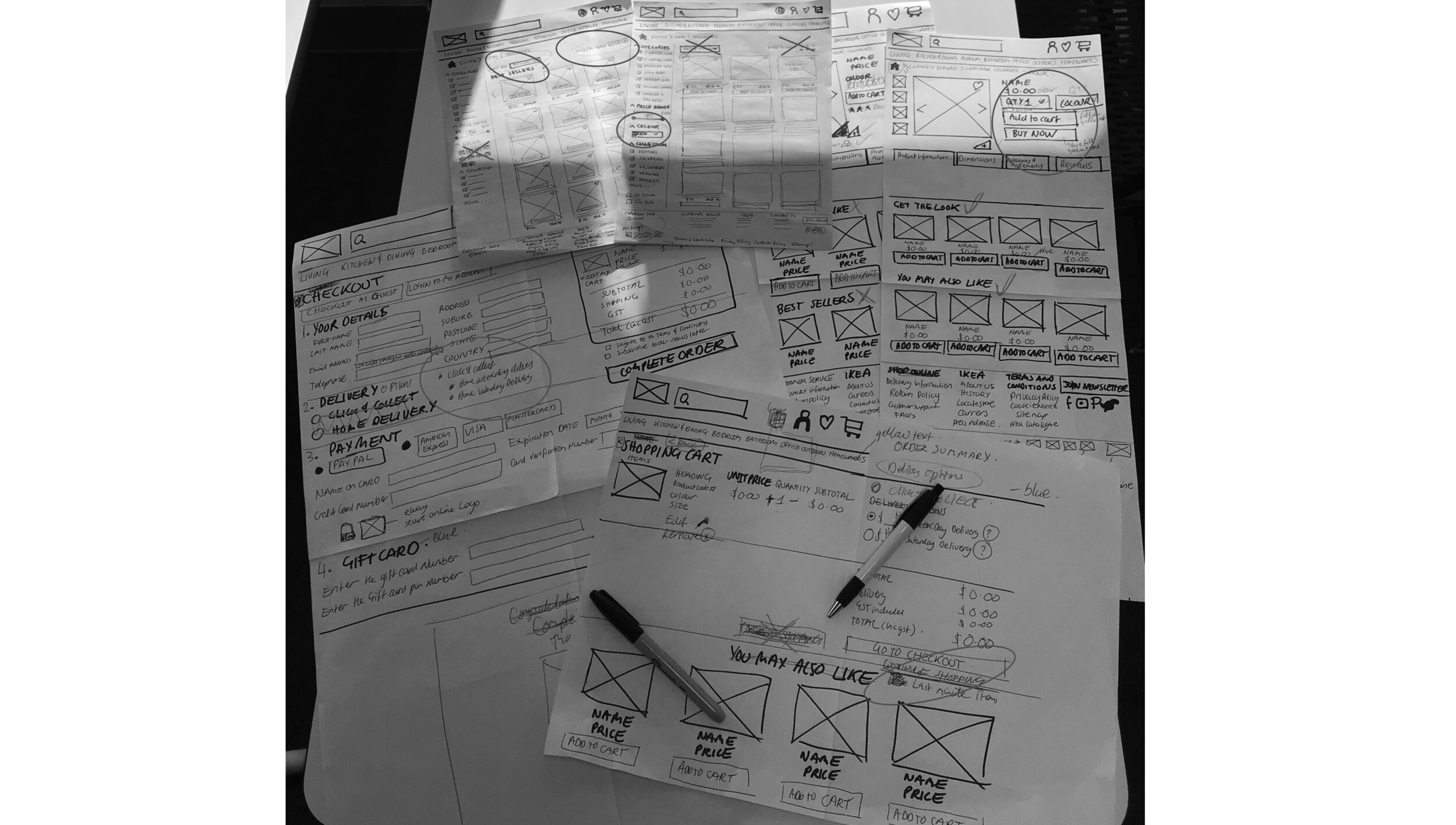
Paper prototype

After testing our first paper prototype, iterating our findings from user testing and repeating the process again, we clearly gained effective information of what the users want and needed, when interacting with our prototype.
The following are some constructive feedback that our users gave us:
Users expect a flag icon over a globe icon to indicate other languages
Users liked the IN STOCK and ON SALE filter options
GET THE LOOK and YOU MAY ALSO LIKE sections tested well
Added +/- option so they can adjust the quantity on the shopping cart page
Cleaned up copy and text hierarchy
Added a pop-up login box
Simplify the layout for the check-out page with a progress tracker

Wireframes in Sketch


. . .
Learnings
Communication, time management and team work played an important factor in this project. Collaborating with people from different backgrounds improved our creative development within the process and made the experience more enjoyable.